
These days, Ecommerce web design can make or break your business. Even if you have amazing products and strong branding, your website’s design is what keeps visitors exploring, or sends them clicking away.
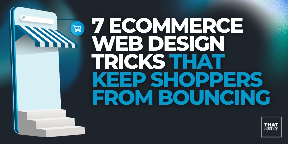
If people are leaving your site too quickly or not finishing their purchases, your web design might be the problem. The good news? A few smart design changes can help keep shoppers engaged and increase your sales.
Here are seven proven ecommerce web design tricks to help reduce bounce rates, improve user experience, and turn visitors into customers.
When it comes to Ecommerce web design, speed and simplicity are two of the most important factors for keeping shoppers on your site. Think about the last time you clicked on a website that took too long to load, did you wait around? Probably not. Most people don’t.
For more insight into how speed affects visibility and conversions, see our guide on SEO Maintenance Defined and 5 SEO Tips to Increase Traffic to Your Website.
Studies show that even a one-second delay in page load time can cause conversion rates to drop by up to 7%. That means if 100 people visit your site and it takes too long to load, you could lose seven potential sales, all because of speed. In today’s world, shoppers expect instant results. If your site isn’t quick, they’ll go straight to a competitor that loads faster.
So, how can you make sure your ecommerce site performs at top speed? Let’s break it down.
To learn how to improve your technical performance, check out 2024 Web Design Trends and Mobile-First Marketing & Google Core Web Vitals.
Here are a few simple but powerful ways to make your website load faster and perform better:
Speed isn’t the only factor that keeps shoppers happy, simplicity plays a huge role, too. A clean, well-organized website helps customers find what they’re looking for without distractions.
When a site feels cluttered, users can get overwhelmed or confused. This often leads to what’s known as “decision fatigue”, when shoppers give up because there are too many choices, buttons, or pop-ups in their way. To learn more about balancing simplicity with creativity, see How to Improve a Website’s Design and 7 Tips to Make Your Website Design Work for Your Business.
Keeping your design simple ensures customers can focus on what really matters: your products, calls-to-action (CTAs), and checkout process.
Here’s what a simple design includes:
Q: How fast should my ecommerce site load?
A: Ideally, your website should load in under 3 seconds. Studies show that after the three-second mark, bounce rates rise dramatically. The faster, the better, especially for mobile users.
Q: Does design simplicity mean my website has to look boring?
A: Not at all! Simple doesn’t mean plain. It means using design elements with purpose. You can still include vibrant images, animations, and bold branding, as long as they enhance the user experience instead of slowing it down or cluttering the layout.
Q: Can I check how fast my website loads?
A: Yes! You can use free tools like:
Q: What’s the most common mistake that slows down ecommerce websites?
A: One of the biggest culprits is unoptimized images, especially product photos. Another common issue is using too many third-party scripts for analytics, chatbots, and ads without balancing performance.
Fast, simple Ecommerce web design doesn’t just make your website look better, it directly affects your business results. A site that loads quickly and feels easy to use builds trust and reduces frustration, both of which keep customers shopping longer and encourage repeat visits.
Let’s look at some benefits:
When you combine technical speed with a clean design, your ecommerce website becomes more than a digital storefront, it becomes a seamless, satisfying shopping experience that keeps people coming back.
One of the top reasons shoppers leave an ecommerce site is frustration. If visitors can’t find what they’re looking for quickly, they’ll click away, and likely never return. Great Ecommerce web design solves this by making navigation clear, predictable, and effortless.
Think of your website’s navigation like the layout of a physical store. If a customer walks into a shop and everything is scattered with no clear signs or structure, they’ll walk out. But if your store is easy to move through, with clear sections, helpful labels, and visible checkout counters, people will stay longer and spend more.
If you’d like to dive deeper into how UX and SEO work together to drive growth, read Marketing Effectiveness and Marketing Analytics 2025.
The same principle applies online. Smooth, intuitive navigation helps customers find products, compare options, and check out without confusion or wasted clicks.
Your website should feel natural to explore. That means everything should be right where users expect it to be. Here are the most important navigation elements to include in your Ecommerce web design:
When users can move easily from one section to another, they’re more likely to explore, stay longer, and make a purchase. But easy navigation also supports several behind-the-scenes benefits:
Essentially, good navigation keeps shoppers in flow, moving from interest to purchase without friction.
For inspiration on user-friendly layouts, check out Top Local Web Designers in Colorado Springs or What You Need in Your New Website in 2023.
Q: How do I know if my website’s navigation is confusing?
A: Try a “five-second test.” Ask someone unfamiliar with your site to visit your homepage. In five seconds, can they tell what you sell and where to click next? If not, your navigation likely needs work. You can also review your site analytics. High bounce rates or short session times often indicate users are getting lost or frustrated.
Q: Should I use a hamburger menu on desktop?
A: Hamburger menus (three stacked lines that expand when clicked) are great for mobile sites, but not ideal for desktops. Desktop users prefer visible options, they shouldn’t have to search for where to click. Use a full navigation bar on desktop for clarity and convenience.
Q: How many items should I include in my main navigation?
A: Aim for 5–7 main items. This number is easy for people to scan without feeling overloaded. You can always include more options in dropdowns or footer menus.
Q: Where should my cart and login buttons go?
A: Always place them in the top right corner of your site, where users naturally look for them. Include clear icons (like a shopping bag or user silhouette) for instant recognition.
Q: How can I make my search bar more effective?
A: Invest in a smart search tool that understands typos, synonyms, and product tags. You can also analyze what users are searching for most and adjust your keywords or product tags to match those terms.
To explore how structure and hierarchy affect SEO performance, see SEO Content Strategy and Guide to Branding Strategies.
To make sure your website navigation meets modern expectations, follow these additional best practices:
Your website’s navigation is more than a menu, it’s a map that guides shoppers through their buying journey. A site that’s easy to move through feels trustworthy, professional, and enjoyable to use.
In Ecommerce web design, navigation should always be built around the customer experience. The goal is to help users find products, learn about them, and make a purchase without confusion or hesitation.
By keeping your structure simple, your links consistent, and your tools intuitive, you’ll create a website that feels effortless to explore, and that’s exactly what keeps shoppers coming back.
Mobile devices now dominate online shopping. In fact, over 70% of ecommerce traffic comes from smartphones and tablets. That means most of your customers are likely visiting your If your website isn’t mobile-friendly, you’re losing potential customers before they even start browsing. For tips, visit 2024 Web Design Trends and Mobile-First Marketing & Google Core Web Vitals.
In Ecommerce web design, this is called mobile responsiveness, the ability for your website to automatically adjust and function properly on any screen size.
When a website isn’t optimized for mobile, pages appear too small, buttons are hard to tap, and images take too long to load. This creates a frustrating user experience that causes shoppers to leave almost immediately.
Mobile-friendly design isn’t just about convenience, it’s about accessibility, usability, and sales. To understand how mobile design and SEO intersect, see How to Build a Website to Dominate Local SEO.
Here’s why focusing on mobile responsiveness is essential for your ecommerce success:
If your site isn’t optimized for mobile yet, this is one of the most valuable changes you can make to your Ecommerce web design. For related insights, read SEO Trends in 2026.
There are several key features and design principles that make an ecommerce website mobile-friendly. These are the essentials:
Once your mobile layout is functional, fine-tune it for better performance and engagement:
Q: How can I tell if my site is mobile-friendly?
A: You can test your site using Google’s Mobile-Friendly Test tool. It will analyze your website and tell you if it meets mobile standards. You can also use tools like BrowserStack or Responsinator to preview your site on multiple devices.
Q: What if my site already looks okay on mobile? Do I still need to redesign it?
A: Possibly. Even if your site appears fine, it may not be optimized for speed, user experience, or conversions. Try testing your site’s mobile load time with Google PageSpeed Insights. If it’s slow or hard to navigate, a redesign or update may be necessary.
Q: Should my mobile site look exactly like the desktop version?
A: Not necessarily. While your branding should stay consistent, mobile design should simplify and prioritize essential information. Remove unnecessary elements that clutter small screens.
Q: What’s the ideal loading time for a mobile ecommerce site?
A: Your goal should be under three seconds. Mobile users are often on the go, and long load times lead to high bounce rates. Compress images, use caching, and limit scripts to keep performance fast.
Q: How can mobile design improve my sales?
A: A smooth, responsive mobile site removes barriers that cause shoppers to leave before buying. When pages load quickly, buttons are easy to tap, and checkout is effortless, more visitors complete their purchases.
In Ecommerce web design, mobile optimization is no longer optional, it’s essential. Mobile users expect a seamless experience that lets them browse, compare, and buy products quickly.
A responsive, well-structured mobile design does more than improve user experience. It builds trust, strengthens your brand, and boosts your search rankings.
When your ecommerce store functions beautifully across every device, you meet your customers where they already are, on their phones. That convenience is what keeps them coming back and makes your business stand out in a crowded online marketplace.
Even if your website loads quickly and is easy to navigate, shoppers may still leave if the page doesn’t feel visually appealing or easy to follow. This is where visual flow comes in, the way your visitors’ eyes move across your website, from one section to another. When done correctly, visual flow guides customers naturally toward your products and calls-to-action.
One of the best ways to improve your site’s visual flow is by seeking Web design inspiration. Looking at successful ecommerce sites can spark ideas for layouts, color palettes, and imagery that engage visitors. Inspiration doesn’t mean copying; it means learning what works and adapting it to your brand.
For creative guidance, explore our article on The Influence of Advertising Photography and Interactive Content Marketing — both highlight the importance of visual storytelling and engagement.
Visual flow affects how users perceive your website and how easily they can take action:
If users don’t know where to look, they may miss products or promotions, even if your offerings are excellent. Good visual flow fixes this problem.
To explore more on that, check out Web Design Best Practices for Turning Visitors into Customers.
Here are some practical ways to design a website with strong visual flow:
Looking for ideas doesn’t have to be overwhelming. Here are some ways to find Web design inspiration for your ecommerce site:
Q: What is “visual flow,” and why does it matter for ecommerce?
A: Visual flow is the natural path users’ eyes follow when looking at your website. It matters because it directs attention to important areas like product listings and CTA buttons. Without a clear flow, visitors may miss products or leave without buying.
Q: How do I balance creativity with usability?
A: Creativity is great, but it should never interfere with functionality. Always prioritize clarity and ease of navigation over decorative elements. Use visuals to enhance the shopping experience, not distract from it.
Q: Should every page follow the same visual flow?
A: Yes, consistency is key. While different pages may have unique elements, maintaining a consistent structure and hierarchy across the site helps users feel comfortable and confident while browsing.
Q: Can small changes make a big difference?
A: Absolutely. Moving a CTA button, adjusting an image, or adding whitespace can significantly improve user engagement and conversion rates.
Q: How do I know if my visual flow is effective?
A: Use analytics tools like Hotjar or Crazy Egg to track where users click and scroll. Heatmaps and session recordings show if your visitors follow the intended path or get stuck.
Strong visual flow, inspired by smart design choices, creates an enjoyable and intuitive shopping experience. When users can quickly see products, understand offers, and navigate the site easily, they’re more likely to buy, and return in the future.
In Ecommerce web design, combining visual flow with inspiration from top-performing sites helps your store look professional, feel engaging, and encourage action. The result is a website that not only attracts visitors but also keeps them exploring and purchasing.
Getting shoppers to add items to their cart is only half the battle. The real challenge is getting them to complete the purchase. Studies show that up to 70% of online shopping carts are abandoned before checkout. One of the biggest reasons? A complicated or confusing checkout process.
A smooth, easy-to-follow checkout is a critical part of Ecommerce web design. If customers face too many steps, confusing forms, or unexpected costs, they’re likely to leave without buying.
To improve your checkout experience, focus on clarity, speed, and trust. Here’s how:
Here are additional tips to make your checkout process smooth and user-friendly:
Q: How many steps should a checkout process have?
A: Ideally, 3–5 steps or a single-page checkout works best. Keep it simple to avoid frustrating users.
Q: Can I require accounts for all purchases?
A: Forcing account creation often leads to abandoned carts. Allow guest checkout and offer account creation as optional.
Q: Should I offer multiple payment options?
A: Yes. The more payment options you provide, the higher the chances customers will complete their purchase. Include widely trusted methods like Visa, Mastercard, PayPal, and mobile wallets.
Q: How can I reduce abandoned carts?
A: Several strategies work:
Q: What role does trust play in checkout design?
A: Trust is critical. Secure, professional-looking checkout pages reassure customers that their payment information is safe. Including SSL certificates, verified payment methods, and clear return policies reduces hesitation.
A complicated checkout creates friction, and friction leads to lost sales. By simplifying every step, you remove barriers between adding a product to the cart and completing the purchase.
Well-designed checkout benefits your ecommerce business by:
In Ecommerce web design, the checkout process is often the final test of whether your site is user-friendly. A smooth, fast, and simple checkout converts more visitors into paying customers and encourages them to return for future purchases.
Online shoppers can’t touch or try your products before buying. That’s why trust is one of the most important factors in ecommerce success. In Ecommerce web design, trust signals, visual cues that show your site is secure, reliable, and professional, play a crucial role in turning visitors into customers.
If your website looks outdated, confusing, or unprofessional, shoppers may leave before even considering a purchase. By incorporating trust-building design elements, you reassure users and increase conversions.
Here are essential design elements that can improve credibility and customer confidence:
Why Trust Matters
Trust affects how shoppers perceive your brand and whether they’re willing to spend money. A website that appears unprofessional, confusing, or unsafe drives customers away. Conversely, a trustworthy site:
Remember, every design choice communicates something about your brand. Clean, professional layouts with visible trust signals signal that your business is credible and reliable.
Common Questions About Building Trust Online
Q: Do I really need SSL and security badges?
A: Yes. Shoppers expect secure transactions. SSL certificates encrypt data and protect customer information. Without them, visitors may abandon their carts immediately.
Q: How many customer reviews should I display?
A: Ideally, show all available reviews, but highlight the most helpful or recent ones. Even one or two authentic reviews are better than none. Make sure reviews are easy to read and visible near the product details.
Q: Can professional design alone build trust?
A: Yes, partially. A polished, clean layout increases perceived credibility, but it works best combined with security measures, reviews, and clear policies.
Q: Should I show both positive and negative reviews?
A: Absolutely. Shoppers often distrust sites with only perfect reviews. Showing a mix of reviews adds authenticity and builds trust.
Q: Where should trust signals be placed?
A:
Trust is a cornerstone of Ecommerce web design. Even if your site looks visually appealing, if shoppers don’t feel secure, they won’t buy. By incorporating clear trust signals, high-quality visuals, and professional design, you create a shopping experience that reassures customers every step of the way.
A trusted ecommerce site not only increases conversions but also encourages loyalty, repeat purchases, and positive reviews, all of which contribute to long-term success.
Even after your website looks great, loads fast, and is mobile-friendly, your work isn’t done. Successful Ecommerce web design is an ongoing process. The best way to keep shoppers from bouncing and increase sales is by tracking performance and making data-driven improvements.
Analytics tools show how visitors interact with your site, what pages are performing well, and where users drop off. By analyzing this data, you can make informed changes that improve the shopping experience, increase engagement, and boost conversions.
Data is the backbone of decision-making in ecommerce. Here’s why analytics matter:
When analyzing your ecommerce site, focus on these important metrics:
Once you have the data, here’s how to act on it:
Q: What tools should I use for analytics?
A: Popular tools include:
Q: How often should I check my analytics?
A: Weekly or monthly reviews are ideal. Regular monitoring helps you catch issues early and track trends over time.
Q: What if the data is overwhelming?
A: Focus on key metrics like bounce rate, conversion rate, and cart abandonment first. Gradually analyze deeper data like CTRs and traffic sources.
Q: Can small design changes really impact results?
A: Absolutely. Even minor improvements, like moving a CTA button, adjusting font size, or simplifying a form, can increase conversions significantly.
Q: How do I know if a change worked?
A: Use A/B testing and compare metrics before and after the change. If conversion rates, engagement, or session duration improve, your update is working.
Why Continuous Improvement Matters
Ecommerce web design is never truly “finished.” Customer behavior, devices, and trends are always evolving. Using analytics ensures that your site continues to meet user expectations and maximize sales.
By tracking data, testing improvements, and adjusting your design based on real user behavior, you create a dynamic, customer-focused website that keeps shoppers engaged and reduces bounce rates.
Analytics allow you to make smart decisions, eliminate guesswork, and ensure your ecommerce site not only looks great but also performs at its best.
A strong Ecommerce web design does more than just look attractive, it drives real business results. When your website loads quickly, looks professional, and guides users naturally, you reduce bounce rates and increase conversions.
By applying these seven tricks, speed, navigation, mobile responsiveness, design inspiration, smooth checkout, trust signals, and analytics, you’ll create a website that doesn’t just attract visitors but keeps them coming back.
At THAT Agency, we build ecommerce websites that balance beauty, performance, and strategy. Our design experts know how to combine creativity with conversion-focused thinking to deliver measurable results.
Ready to transform your online store with professional Ecommerce web design? Contact THAT Agency today to get started.
Tags: Web Development, Web Design, Graphic Design, UX Design

What Is Organic Traffic? (Complete Beginner Guide)
What Is Conversion Rate Optimization? (CRO Basics Explained)
What Is Engagement Rate? (Marketing Metric Explained)

How to Appear in ChatGPT Answers: Understanding AI Citation Signals

AI-Generated SEO Content at Scale: Why Output Without Strategy Damages Authority

700 S. Rosemary Ave.
Suite 204-707
West Palm Beach, FL 33401
P: 561.832.6262
F: 561.832.7707


