
Remember when it was a big deal to be “mobile-friendly”? Back in the day…! It seems almost quaint that we suddenly realized that our websites needed to load, respond, and allow for interaction on screens a third or a quarter of the size of a desktop monitor or laptop.
Today, 85% (96% of those 18-29 and 95% of those 30-49) of the US population owns a smartphone; the average user spends 5 hours on their device - not including work-related activities. So, mobile-friendly isn’t an option. But nor is it enough.
Mobile-first marketing is essential when it comes to capturing the attention, and purchasing power, of your target audience. And it is mission-critical in achieving a prominent position in the search engine results pages.
How does a mobile-first experience connect with Google Core Web Vitals?

Google Core Web Vitals is a set of metrics that impact user experience when they interact with your website’s pages. Speed, responsiveness, and visual stability are the core pillars if you will.
Basically, Google is looking at factors such as load time, the stability of your content when it loads, the level and ease of interactivity, etc., to understand how users perceive the experience when they are on a certain page.
Through your Google Core Web Vitals report, you can uncover problem areas that are impacting user experience - and thus your search ranking. According to Google, “Optimizing for these factors makes the web more delightful for users across all web browsers and surfaces, and helps sites evolve towards user expectations on mobile.”
How does mobile-first marketing come into play?
In a move years in the making, Google has adopted a mobile-first indexing initiative. In other words, content that is visible and usable only on desktops will be discounted by the search engine in favor of mobile sites. Say a site contains the same great information, images, videos, content, etc. Google will prioritize the site that is easier to read, and that is almost always mobile.
Take steps (now… today… right after you read these tips!) to implement a mobile-first marketing strategy. Of utmost importance:
THAT Agency’s team of web designers will build fast, responsive, interactive, sites that highlight your brand in a fresh way. Let’s get started.


What Is Organic Traffic? (Complete Beginner Guide)
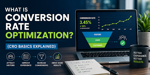
What Is Conversion Rate Optimization? (CRO Basics Explained)
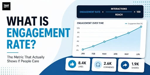
What Is Engagement Rate? (Marketing Metric Explained)

How to Appear in ChatGPT Answers: Understanding AI Citation Signals

AI-Generated SEO Content at Scale: Why Output Without Strategy Damages Authority

700 S. Rosemary Ave.
Suite 204-707
West Palm Beach, FL 33401
P: 561.832.6262
F: 561.832.7707


