Imagine it’s 1997. You load the web page for your favorite business. You see a bright blue background. A headline flashes at you in neon yellow. A MIDI file streams in the background, offering you a cacophony you didn’t even know you wanted to hear.
A lot has changed since the early days of web design, and even if your site doesn’t look like it belongs in 1997, the chances are good that there are at least a few things you could do to improve your design to ensure it’s better optimized or to connect better with your customers. How long does it take to build a website, though, and where will you learn how to improve a website design? Keep reading to learn more.
How Long Does It Take to Build a Website?
If you’ve decided you need to start from scratch, you may have to wait a bit to have your website built. On average, it will take a professional designer between two and five months to build a website design that meets your needs.
It’s important to note, though, that not every website needs that much work. Sometimes a simple refresh will do. How long does it take to build a website if you’re giving it a simple refresh? You can have an updated appearance in just a few weeks.
How to Improve a Website Design
If you think a simple refresh might be the way to go, you may be left wondering how to improve your site’s design. Don’t worry! You won’t have to take any classes or read any long books about how to improve a website design to change a few things. Instead, just taking a few simple steps can help create something better.
Start With a Plan
The single best thing you can do is to begin by deciding exactly what needs to change on your site. It may help to map your customer’s journey from start to finish. Think about what pages they might see on that journey and which elements they will likely interact with. Understanding the steps a customer might take can help ensure your overall site design leads them through the sales funnel.
For some, that means a closer look at your CRM. If you don’t have a CRM, though, you may want to interview some of your current customers so you can learn more about the journey they took. Those interviews will help paint an accurate picture of the essential parts of your website.
Think About Your Page Speed
If your pages load fairly slowly, you may fail to capture any traffic to your website. Pages that load slowly can also affect your search engine rankings. A great way to address that problem is to simply. There may be distracting elements that damage the value of your page anyway. Studies have shown that you have only eight seconds to capture their attention, so ensure your page loads quickly and is fairly clean from the start.
To achieve this, look back at your brand guidelines. Ensure you’ve detailed fonts, colors, and even your logo. All of that will help you better design your page. If you have font styles that don’t seem to fit or too many on-page images that don’t reflect your brand, eliminate them. Stick to what works for you, and your load speed will increase. Don’t worry about white space. It will help draw your potential customer’s eyes to all the right elements.
Don’t forget, too, that you’ll want to make your site mobile responsive. The best sites need to load as quickly and as well on a desktop or a laptop as they do on a mobile device. Many potential customers will initially come to you through a mobile device, and ensuring your site is responsive is necessary.

Ensure Your Content is Fresh
Fresh content means material that you’ve recently published or updated. Your users are likely to want fresh content, and Google does too. In 2011, they published a freshness algorithm update, and that means that since that time, they prioritize new pages with updated information over outdated ones.
Besides just being more search engine friendly, though, fresh content is more customer friendly, too. After all, the last thing you want is content advertising your December sale in March.
Reimagine your Call to Action
What exactly do you want them to do after they land on your page? Sign up for your email marketing list? Shop through your products? Contact you for services? If you’re not sure, your customers aren’t sure either, so it may be time to reimagine the call to action you already have on your site.
Consider creating easy buttons that fit with your existing brand’s colors and fonts. Think carefully about the text involved. Remember, you need them to do something, so use action-oriented words that push the reader to make a move. Don’t forget to include your contact information so they can easily reach out if they have questions.
Test Everything
If you’re working on your website, test absolutely every piece of it. You’re going to want to make certain that it works well and looks amazing the moment you release it, and that may not happen if there’s been a coding error or another small problem. Do what you can to mitigate those problems.
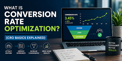
Keep in mind, too, that your needs may change over time, and if you’re tracking the metrics as you should be, you may want to run A/B testing on your site to see what is and is not working well for your users so you can make updates to your pages in those spaces too.
Don’t Let Your Site Remain Static
If you’re ready to update your site but can’t quite connect with the right steps, let us help. We offer creative digital marketing strategies that will drive the results you want from your site. Give us a call today to learn more.


