
Accessibility is the quality of being able to be reached or entered. When we speak of accessibility in a graphic design aspect, we mean that the person will have access; not only to use software if needed to journey through information just as an able person is, the content itself will have a “cleared”, “core” version to meet accessibility standards. We rarely, but absolutely should keep this in mind when designing, developing and creating new content to release to the public. These accessibility needs could range from, perceivable; which are text content and non-text content, time-based media; which are audio, video, and captions and distinguishable; which are the use of color, audio control, and alternate text. We will only go through the main topics that directly affect digital designing but feel free to explore more as needs arise. To learn more please visit, W3.org.

To target the perceivable (text and non-text) content you must provide text alternatives for any non-text content so that it can be changed into other forms people need, such as large print. Most digital browsers, software and programs have functions to allow users to increase or decrease size. Creating versions of same downloadable PDF can be helpful. This “Accessible PDF” should have only high contrast text, no backgrounds to text, and alternate text for all images used.
To target the time-based media (audio, video, and captions) content you must provide alternatives for all. Audio would need to have a full typed out transcript, video would need to be full captioned, and captions must have all scenes and gestures spelled out so that users don’t lose a beat when experiencing content.
To target the distinguishable (use of color, audio control, resizing and alternate text) content you must make it easier for users to see and hear content including separating foreground from background. Use of color is the biggest culprit in breaking this rule. Using high contrast (black text with white background or vice versa) is the easiest way to address this concern. Audio controls must always be accessible to users to adjust volume control. Note, if you upload your video content to YouTube or Vimeo, they will always have controls for users to adjust. Alternate text is the lifeline for understanding an image. Note to be most descriptive in naming these so that users can get message if visually impaired.
Overall, accessibility needs to be in the forefront when designing so that everyone has an equal foundation to build off. By starting and continuing this practice, all users will have complete access to all your business’s materials. This will also bring awareness to the always overlooked needs we have in the digital and non-digital worlds. If you have questions or need to bring your business to accessibility standards, please reach out to us at THATagency.com. Let’s get to work!
Tags: Digital Marketing, Branding, accessibility

What Is Organic Traffic? (Complete Beginner Guide)
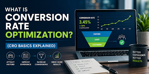
What Is Conversion Rate Optimization? (CRO Basics Explained)
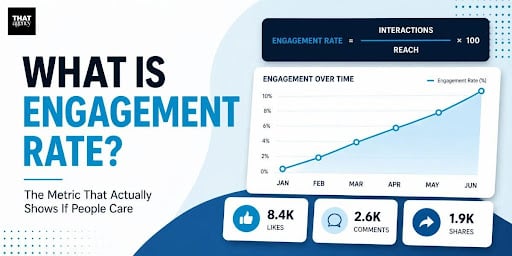
What Is Engagement Rate? (Marketing Metric Explained)

How to Appear in ChatGPT Answers: Understanding AI Citation Signals

AI-Generated SEO Content at Scale: Why Output Without Strategy Damages Authority

700 S. Rosemary Ave.
Suite 204-707
West Palm Beach, FL 33401
P: 561.832.6262
F: 561.832.7707


