
As we begin 2015, it’s becoming increasingly more important that all sites are optimized for mobile performance and user-friendliness. While we’ve been seeing the growing trend across the search marketing sphere over the past several years, it’s no more prevalent than today, just how high the importance is. Google has recently taken it upon themselves to begin sending out mass notifications to webmasters whom are not getting with the times, and updating their sites to ensure seamless transfers and overall mobile-friendliness.
 This new directive that Google took, in the warning of mobile searches, begs the question of whether they are getting ready to launch a new mobile ranking algorithm. There has been ongoing discussion for the past few months, about Google experimenting with a mobile-friendly enhancing label of some sort; something that specifically boosts the search rankings for sites whom are fully mobile-friendly. They have also been launching new mobile-related tools within Webmaster Tools to further assist users, like the mobile friendly tool and the mobile usability reporting tool.
 If you received warning like this recently, head into your Webmaster Tools account and go to the Mobile Usability section, under Search Traffic. You’ll see a list of all of the errors, and how many of those errors occur. Note some of the major usability concerns Google points out:
Check out your Google Webmaster Tools for these issues, and make the necessary changes fast. We recommend trying to get ahead of any new algorithm changes, and optimize your site for the future [and present] of mobile searches. Get ready for something big to come; we know Google is!
Tags: SEO, What's Trending, Digital Marketing

What Is Organic Traffic? (Complete Beginner Guide)

What Is Conversion Rate Optimization? (CRO Basics Explained)
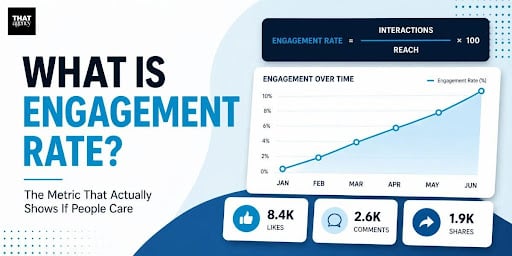
What Is Engagement Rate? (Marketing Metric Explained)

How to Appear in ChatGPT Answers: Understanding AI Citation Signals

AI-Generated SEO Content at Scale: Why Output Without Strategy Damages Authority

700 S. Rosemary Ave.
Suite 204-707
West Palm Beach, FL 33401
P: 561.832.6262
F: 561.832.7707


