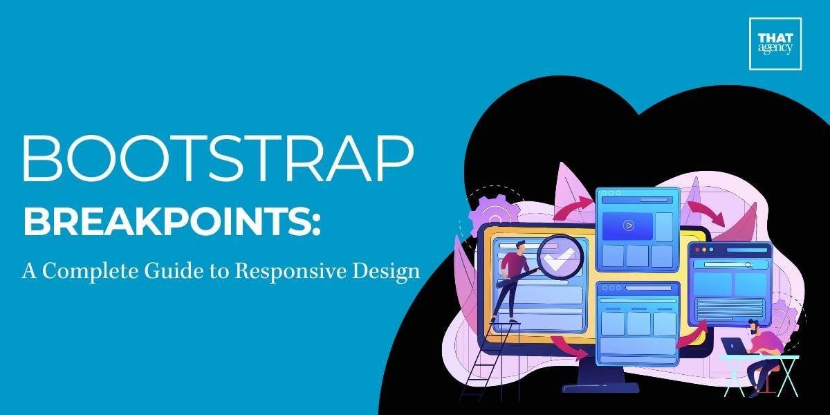
In today's world, websites need to look good on all types of devices, whether it’s a smartphone, tablet, or desktop. This is where responsive design comes in, and bootstrap breakpoints are an important part of making sure a site adjusts to different screen sizes. Bootstrap is a popular tool for web developers, and its breakpoints make it easier to design websites that work well no matter the device.
This guide will explain what bootstrap breakpoints are, why they matter, and how to use them to create a responsive website that looks good everywhere.
What Are Bootstrap Breakpoints?
In web design, a breakpoint is a specific point where a website’s layout changes depending on the size of the screen the user is viewing it on. This change is crucial for making sure websites look good and function well across a variety of devices, from small mobile phones to large desktop monitors.
Bootstrap breakpoints are predefined widths at which the website layout will adjust. These breakpoints are part of the Bootstrap framework, a popular tool used by web developers to build responsive websites. At certain screen widths, the design of the site might change in several ways:
- The number of columns may increase or decrease.
- Font sizes might change for readability.
- Images could resize to better fit the screen.
- Spacing between elements might adjust.
These changes help keep the design user-friendly on any device, improving the overall browsing experience.
Why Are Breakpoints Important?
In today’s world, responsive web design is not optional—it’s necessary. People access websites from many different devices, and each of those devices has a different screen size.
Here’s why breakpoints matter:
- Mobile usage is dominant: Over half of all web traffic globally comes from mobile devices. If your website is only designed for desktops, you risk alienating a large portion of your audience.
- Improved user experience: A responsive website adapts its layout based on the user’s device, providing a smoother, easier-to-navigate experience. This keeps users engaged and less likely to leave the site.
- SEO benefits: Search engines, like Google, prioritize mobile-friendly websites in search results. Websites that use breakpoints to ensure they are responsive can rank higher and attract more traffic.
By using bootstrap breakpoints, you ensure that your website works well on all screen sizes, leading to:
- Longer session times: Users are more likely to stay on a website that’s easy to navigate.
- Lower bounce rates: If your site doesn’t load well on mobile, users will leave quickly. Responsive designs help reduce this.
- Higher conversion rates: A well-optimized, user-friendly website can turn visitors into customers, as they can easily interact with your content no matter the device.
How Do Bootstrap Breakpoints Work?
Bootstrap is built with a mobile-first approach, meaning the framework assumes that the smallest screen sizes will view the website first. Styles and design elements are optimized for mobile, and then, as the screen size increases, additional styles are added to adjust the layout for larger screens.
Bootstrap includes five main breakpoints that correspond to different device types. These breakpoints ensure that your website layout will adjust smoothly as the screen size changes. Let’s go through each one in detail:
- Extra Small (XS): <576px
- Device Type: Phones in portrait mode (holding the phone vertically).
- Layout: At this size, content is typically shown in a single column, making it easier to read on small screens. You can expect to stack elements vertically so users can scroll through them easily.
- Why is this important?
Most mobile users hold their phones vertically. A single-column layout ensures the text is readable and the navigation is simple, without the need for users to zoom in or scroll sideways.
- Small (SM): ≥576px
- Device Type: Larger phones and small tablets.
- Layout: The layout may still be a single column, but you can start adding adjustments like larger font sizes or padding to improve readability and user experience.
- Why is this important?
As the screen gets slightly larger, the text and images don’t need to be squeezed into a tiny space. Padding and font size adjustments ensure the content remains clear and easy to read.
- Medium (MD): ≥768px
- Device Type: Tablets and smaller desktop screens.
- Layout: At this size, you can start introducing multiple columns. For example, content could be organized into two columns, allowing for better use of space and improved content organization.
- Why is this important?
Tablets have more screen real estate, which gives you more freedom to spread out your content. Introducing two columns makes your layout more dynamic and allows for side-by-side content (such as text and images).
- Large (LG): ≥992px
- Device Type: Desktops and laptops.
- Layout: A three-column layout is now possible, and more content can be displayed side by side. This layout is typically used for desktop views where space is no longer a limiting factor.
- Why is this important?
At this breakpoint, users are likely on larger screens where more content can be displayed at once. This reduces the need for scrolling and makes better use of horizontal space.
- Extra Large (XL): ≥1200px
- Device Type: Large desktops and monitors.
- Layout: The layout can expand even more, creating a spacious design that uses multiple columns and adds more space between elements.
- Why is this important?
For users on large desktop screens, the site can spread out into multiple columns, providing a clean and professional look. The extra space between elements helps prevent the layout from feeling cramped.
What Do These Breakpoints Mean for Developers?
The bootstrap breakpoints make it easy for developers to create responsive designs without having to manually code media queries for different screen sizes. Bootstrap’s grid system and breakpoints allow you to define how many columns an element should take up at each screen size.
For example:
- At the smallest screen size (XS), you might want all elements to be stacked in one column.
- At a medium screen size (MD), you could split the content into two columns.
- At a large screen size (LG), you might go for a three-column layout.
This flexibility means that with just a few simple classes, you can create layouts that adjust automatically based on the user’s screen size.
How Do You Use Bootstrap Breakpoints in Practice?
Here’s a step-by-step explanation of how you might use Bootstrap’s grid system with breakpoints:
- Start with the grid: Bootstrap’s grid is based on 12 columns, which you can divide in different ways. For example, at the smallest breakpoint (XS), you might assign each element the full 12 columns (so each one takes up the entire screen width).
- Add breakpoints for larger screens: As the screen size increases, you can assign fewer columns to each element. At the medium breakpoint (MD), you might give each element 6 columns, so two elements are displayed side by side.
- Fine-tune your layout: For even larger screens, you can continue adjusting the number of columns each element occupies, ensuring your design looks good on any screen size.
Why Use Bootstrap’s Predefined Breakpoints?
Bootstrap’s predefined breakpoints save developers time and effort by providing a framework for responsive design that works out of the box. You don’t need to spend time coding custom media queries for every possible screen size. Bootstrap’s breakpoints in bootstrap are based on common device sizes, ensuring your website looks great on most devices people use today.
Bootstrap breakpoints are a key part of making websites responsive, ensuring they adapt to different screen sizes and provide the best possible user experience. Whether you’re designing for mobile phones, tablets, or desktop screens, Bootstrap’s predefined breakpoints make it easier to create flexible, user-friendly layouts.
Customizing Bootstrap Breakpoints
Sometimes, the default breakpoints don’t fit your project exactly. Luckily, Bootstrap allows you to customize them by changing the $grid-breakpoints Sass variable in the source files. This is useful when you need a breakpoint at a specific width.
For example:

In this case, you’re setting breakpoints at custom widths that better fit your project’s needs.
Using Bootstrap Breakpoints in Your Projects
Using Bootstrap breakpoints in your design is easy, thanks to Bootstrap’s grid system. Bootstrap’s grid is based on 12 columns, which can be divided into different sizes depending on the screen width.
Here’s an example:

In this example:
- On screens smaller than 576px, all three columns stack vertically, each taking up the full width.
- On medium screens (≥768px), the first two columns take up half of the screen width each, forming a two-column layout.
- On large screens (≥992px), each column takes up one-third of the screen.
This system allows your design to adapt to different screen sizes effortlessly.
Breakpoints in Bootstrap: How They Help with Web Development
Breakpoints in Bootstrap are one of the most powerful tools for creating responsive websites. While they are commonly used to adjust column sizes in a grid layout, their functionality goes far beyond that. Breakpoints allow developers to control many other elements of a webpage, ensuring it works smoothly across all device sizes.
Here’s how breakpoints in Bootstrap can enhance your web development process:
- Font Size: Breakpoints let you adjust font sizes based on the device being used. For instance, text can be displayed larger on desktop screens and smaller on mobile devices for easier reading.
- Spacing: You can control the amount of padding and margin around elements. This is helpful when you want to make sure your content isn't cramped on smaller screens or spread too far apart on larger ones.
- Navigation Menus: On smaller screens, you can change a traditional horizontal menu into a more compact hamburger menu, which is easier to use on mobile devices. This helps keep your layout clean and easy to navigate, regardless of screen size.
- Images and Videos: Breakpoints also let you hide, show, or resize images and videos based on the screen size. You can choose to hide larger images on mobile devices to speed up load times while showing them on larger screens where they have more room to display.
This flexibility makes Bootstrap a great choice for developers who want to build responsive websites. Instead of creating separate designs for different devices, you can use bootstrap breakpoints to adjust one layout for various screen sizes.
Questions Readers May Have:
- What happens if I don’t use breakpoints in my design?
- If you don’t use breakpoints, your site will likely look good on one device size but not others. For example, a layout designed for desktops might look too crowded on mobile, or images might overflow the screen.
- Do I have to use all the Bootstrap breakpoints?
- No. You don’t have to use all the breakpoints Bootstrap provides. You can pick the ones that make sense for your project. For example, if your audience mostly uses mobile devices, you can focus on the smaller breakpoints.
- Can I customize breakpoints in Bootstrap?
- Yes, you can customize the default breakpoints by modifying Bootstrap’s grid system, using Sass or CSS. This gives you more control over how your site looks on different devices.
Best Practices for Using Bootstrap Breakpoints
To get the most out of bootstrap breakpoints and ensure your website works well across all devices, it’s important to follow best practices. Here are some tips that will help you build responsive and efficient websites:
1. Start with Mobile (Mobile-First Design)
When building a website, it’s best to design for the smallest screens first. This approach is called mobile-first design. Mobile-first design ensures your site will load faster and function well on mobile devices, which are often slower than desktop computers.
- Why is mobile-first important?
Mobile users make up a huge portion of internet traffic today, and their devices often have slower internet connections. Starting with mobile-first design ensures that your website works well on mobile before you enhance it for larger screens.
- How to do it in Bootstrap:
Bootstrap’s grid system is built mobile-first. By default, styles are applied to small screens first, and larger styles are added as screen size increases. This is a good way to ensure that your mobile experience is optimized.
2. Test Often
Responsive design requires regular testing to ensure your website looks and works as expected on all devices. You’ll need to check how your website responds to different screen sizes using real devices or online testing tools like Chrome’s developer tools or browser-based testing platforms.
- What should I test?
Test how your columns stack or adjust at different breakpoints. Check how images and videos are displayed on various screens. Make sure text is readable and that navigation works properly on both mobile and desktop.
- Why is testing important?
Each device and browser can display your site slightly differently. Testing helps you catch any issues before your site goes live.
3. Keep It Simple
While it might be tempting to create many custom breakpoints, this can overcomplicate your design. Stick to a few well-defined breakpoints that cover the main device types your audience uses: small (mobile), medium (tablets), and large (desktops).
- Why keep it simple?
More breakpoints mean more CSS rules to maintain. This can make your code harder to manage and potentially slow down your site’s performance.
- How do I know which breakpoints to use?
Analyze your site’s traffic to see which devices your visitors are using most. If the majority of your users are on mobile, you may not need as many breakpoints for larger screens.
4. Optimize Performance
Large images, complex layouts, and excessive content can make your site load slowly, especially on mobile devices. Optimizing your website for performance is key to providing a good user experience.
- How do I optimize performance?
Compress images, minimize CSS and JavaScript files, and load only what’s necessary for each screen size. Bootstrap allows you to hide images or elements at smaller breakpoints to reduce the amount of data mobile users need to load.
- Why does performance matter?
Users are more likely to leave your website if it takes too long to load. By optimizing your site’s performance, especially on mobile, you can improve user satisfaction and increase the chances of them staying on your site longer.
Common Performance Issues to Avoid:
- Loading large images on mobile: Use smaller, compressed images for mobile devices.
- Too much JavaScript: Minimize and combine your scripts to improve loading times.
- Overcomplicated layouts: Keep your layout simple and avoid unnecessary elements, especially on smaller screens.
Using bootstrap breakpoints properly is essential for building responsive websites that work well on all devices. Whether it’s adjusting the layout, controlling the size of images, or managing navigation menus, breakpoints allow you to create a site that adapts to the needs of your users.
Conclusion
Bootstrap breakpoints are key to creating a responsive website that works well on all devices. With Bootstrap’s easy-to-use grid system and customizable breakpoints, developers can ensure their designs adapt smoothly to any screen size.
Ready to use bootstrap breakpoints in your next project? THAT Agency specializes in creating responsive, user-friendly websites. Contact us today to see how we can help take your website to the next level!
Editors Note: This Blog was originally published on 7/26/2018 and updated on 10/7/2024 for accuracy.