
If you have been playing around with HTML / CSS for a while and feel a little bit comfortable with the basic principles, but now you want to start getting your feet wet with some more advanced concepts, this article is for you. Check out these five tips on coding for beginners to give you an edge over your fellow coders and get you on your way to becoming a professional front-end developer.

Over the years, I have seen a lot of my peers overthinking media queries to the point where they end up with tangled, spiderweb-like media query breakpoints. Not only does that make for bad practices, it also creates a nightmare scenario when trying to debug - or worse, if someone else tries to edit your code later, that person will not be happy.
A well-planned design shouldn’t need more than two or three media query breakpoints – one to begin the transition out of mobile territory, one to start the adventure into horizontal screens, and finally one (sometimes, and I mean rarely, two) to bring in all the bells and whistles and construct your full desktop experience.
One breakpoint you definitely don’t need to use is the one which starts at 0px. Think about it, if you are (and you should be) going with the mobile-first approach and using “min-width” instead of “max-width” in your media queries, why would you need to specify a minimum of zero pixels? I can’t think of any screen which is smaller than zero pixels – is that even physically possible?
So, if you write your CSS for mobile devices outside of any media queries, with a little planning in the design stage, you can start your media query breakpoints with the “vertical tablet” size (which is right around 768px). Here are some examples:
|
@media only screen and (max-width : 767px) { /* Do stuff for mobile */ } @media only screen and (min-width : 768px) { /* Do stuff for vertical tablet */ } |
|
/* Do stuff for mobile (outside any media queries) */
@media only screen and (min-width : 768px) { /* Do stuff for vertical tablet */ } |
This unsung hero of HTML syntax gives you the ability to load different images automatically based on the user’s viewport size. The way HTML tells the browser to perform this sleight of hand is through the use of media queries within the <picture> tag. (OK, really within the <source> tag, which is located within the <picture> tag. You’ll see in a moment.)
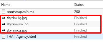
Consider this real-world scenario: you built a beautiful landing page with a really nice hero image with a file size of about 150K, but then the cost in kilobytes becomes an issue when trying to optimize your assets for mobile. What do you do, hotshot? You could go back to the drawing board and figure out another solution perhaps involving background images, or maybe using multiple <img> tags, hiding one or two with CSS across your breakpoints. But then you check the network traffic on your favorite debugging inspector, and you notice that even though your image is set to “display:none,” it is still loading despite the fact that it isn’t visible on the page. Here are a couple examples:
|
<!-- Load smallest image for mobile devices --> <img src="skyrim-xs.jpg" alt="tamriel" class="img-fluid d-block d-sm-none" > <!-- Load different image for vertical tablet devices --> <img src="skyrim-sm.jpg" alt="tamriel" class="img-fluid d-none d-sm-block d-md-none" >
<!-- Load full-scale image for desktop screens --> <img src="skyrim-lg.jpg" alt="tamriel" class="img-fluid d-none d-md-block" > |
This approach actually ends up costing you more KB than necessary, because you are technically loading all three images at once regardless of breakpoints or screen size. Take a look at this screenshot from the Network tab in Chrome’s Inspector window and you’ll see what I mean.
|
<picture> <source media="(min-width: 768px)" srcset="skyrim-lg.jpg"> <source media="(min-width: 480px)" srcset="skyrim-sm.jpg"> <img src="skyrim-xs.jpg" alt="tamriel" class="img-fluid" > </picture> |
Now take a look at the Network tab using the HTML Picture tag:
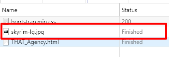
The reason you only see one image coming across on the network is because of the way the HTML Picture tag loads content. A browser loops through the provided source tags starting from the top, and when it finds a media query that is true, it displays that image and ignores the rest of the sources. In this case, if the site visitor is using a mobile device with a screen width of 375px, the browser will test the first two source tags, see that neither one is a match, then it will default to the <img> tag, which specifies the mobile-specific image. Pretty cool, right? This is a great way to save yourself some KBs when trying to optimize your pages for mobile devices. For further reading about the usage and additional attributes of this very useful HTML tag, check out this page on w3schools.
OK, so this one isn’t exactly the easiest to learn when coding for beginners, but it’s probably the most important. Flexbox is out there changing the game, and it is fully supported by all current major browsers. The biggest setback of this CSS property is the fact that you still need to use a set of prefixes to make your code compatible with older browsers.
Believe me, I don’t understand why there are people out there using older browsers. It kind of seems like an urban legend, but the hard fact of life is that there really are people out there using out-of-date browsers – so we use prefixes until they all update their browsers.
But besides that, Flexbox is great, and that’s to say the least. The Flexible Box Layout Model, as it is called, is rapidly gaining popularity and, in my opinion, will be the standard in the coming years. So, do yourself a solid and learn it. Unfortunately, there is just too much ground to cover for one blog post, so we will not be getting into a lot of details, but there are plenty of great resources out there that make it easy to learn Flexbox (trust me, it’s worth learning). Here are a few of the resources that helped me learn it, and also still serve as a reference point for those space-cadet moments:
W3C Schools reference page - https://www.w3schools.com/Css/css3_flexbox.asp
Useful list of required Flexbox prefixes over at CSS-Tricks.com - https://css-tricks.com/forums/topic/flexbox-prefixes/
Visual guide to Flexbox from CSS-Tricks.com - https://css-tricks.com/snippets/css/a-guide-to-flexbox/ (This really helps put things into perspective.)
Here we go with another advanced framework to learn. I know what you’re thinking. This article has the word “easy” in the title, and now I’m throwing frameworks and box models at you. But don’t worry, once you get into it, you will not be sorry.
For me, when I first came across these technologies, it was exciting. I thought back to the old days when HTML was a new kid on the block, and everything was all over the place with no clear standards, and even worse, multiple technologies competing for a place in the HTML standardization model. That made things very confusing at best, and a downright fist fight at times when you wanted to achieve certain layouts.
Fast forward 25 years, and now we have things like Flexbox, that lets you easily flow elements within a responsive layout, and Bootstrap framework, that gives you a solid foundation from which to start your HTML projects. So, let’s take advantage of these things which make our lives easier.
And that’s exactly what Bootstrap is all about: making things easier. At its core, Bootstrap is basically a very large CSS stylesheet which, when loaded, gives you access to numerous handy little CSS classes you can use throughout your layout for everything from templating to stylizing text. The idea is that if you have all this CSS already pre-written (all you need to do to start using Bootstrap is place a link to the stylesheet in the head of your HTML document), you will save yourself a lot of time by not having to write it all every time you start a new project. And it really does save you a lot of time, it’s actually pretty amazing!
I mean, think about it. It took a lot of very smart people almost four years to develop just the latest version of the framework, which is version 4. Bootstrap was originally developed by Mark Otto and Jacob Thornton over at Twitter as an internal tool. Then they shared it with the world back in 2011.
Today, Bootstrap is the second-most starred project on GitHub. That’s because it is a very useful tool, and it is extremely easy to learn. It just takes a little bit of reading. OK, a lot more reading, but it’s worth it! Here are a couple of resources to get you started with Bootstrap:
Bootstrap 4 tutorial from W3C Schools - https://www.w3schools.com/bootstrap4/
The official Bootstrap website - http://getbootstrap.com
OK, back to the easy stuff. These CSS pseudo classes should be an easy win for anyone just getting started. But first, let’s look at the definition of a pseudo class. The World Wide Web Consortium (W3C) defines a pseudo class as follows:
A CSS pseudo-class is a keyword added to a selector that specifies a special state of the selected element.
So what does that mean? What “keyword” is it talking about? Well, look here for a complete list of those keywords.
But what do these keywords do? Glad you asked. The keywords mentioned in the W3C definition correspond to different “states” of certain HTML elements. Depending on certain user interactions, or even interactions with neighboring elements on the page, HTML elements will have additional or hidden attributes known as “states” like :visited for a link on which the user has previously clicked, :first-child for an element which appears first relative to its siblings within a parent container, and :checked for a checkbox which the user has checked off.
Let’s back it up a little bit. CSS is all about targeting elements in the DOM and stylizing them. But in addition to targeting elements in their natural states, we can also use these keywords to target elements with more specificity based on different parameters. For example, let’s say we have three red blocks on the page and we would like to change the color of the first block to green. This is how we would do that:
|
.blocks { background-color:red; } |

|
.blocks:first-child { background-color:green; } |

See what I did there? I targeted the first block using the pseudo class :first-child. Here is another example: lets say we have a blue box on the page which we would like to turn green when the user hovers the cursor over it. This is how we would write that:
|
.box { background-color:blue; } .box:hover { background-color:green } |

Again, we used a pseudo class to target the box in the “hover” state. Here is a little more advanced use of CSS pseudo classes, which I find myself using frequently:
|
.blocks { background-color:blue; } |

|
.blocks:nth-child(odd):not(:first-child) { background-color:green; } |

As you can see, there is a lot that you can do with CSS pseudo classes. And we haven’t even scratched the surface with these few examples. Check out the following resources for a more comprehensive list of pseudo classes and exactly what they do. Trust me, these are very fun to use, and they really come in handy when you are trying to select different elements in the DOM.
CSS pseudo classes reference over at W3Schools -
https://www.w3schools.com/css/css_pseudo_classes.asp
Pseudo classes reference at Mozilla Developer Network -
https://developer.mozilla.org/en-US/docs/Web/CSS/Pseudo-classes
In closing, HTML these days is a comprehensive and standardized coding language, which when used properly, can help you achieve beautifully designed fluid layouts for your web pages.
If you are a beginner, hang in there, keep learning as much as you can, and most importantly, keep practicing. The more you code and master things like media query breakpoints, the better you will be at it. And the better you are at coding, the further you will go in your career. I hope these (kind of) easy tricks for coding for beginners will help you along your journey to be a full-blown professional web developer. If not, well, at least we had fun together!

Tags: Web Development

What Is Organic Traffic? (Complete Beginner Guide)

What Is Conversion Rate Optimization? (CRO Basics Explained)
What Is Engagement Rate? (Marketing Metric Explained)

How to Appear in ChatGPT Answers: Understanding AI Citation Signals

AI-Generated SEO Content at Scale: Why Output Without Strategy Damages Authority

700 S. Rosemary Ave.
Suite 204-707
West Palm Beach, FL 33401
P: 561.832.6262
F: 561.832.7707


