
Responsive web design used to be something extra, now, it’s a must-have. Today, more people use their phones and tablets to browse the web than ever before. In fact, over 60% of internet traffic comes from mobile devices. If your website doesn’t look good or work well on a smaller screen, you're losing visitors, and potential customers.
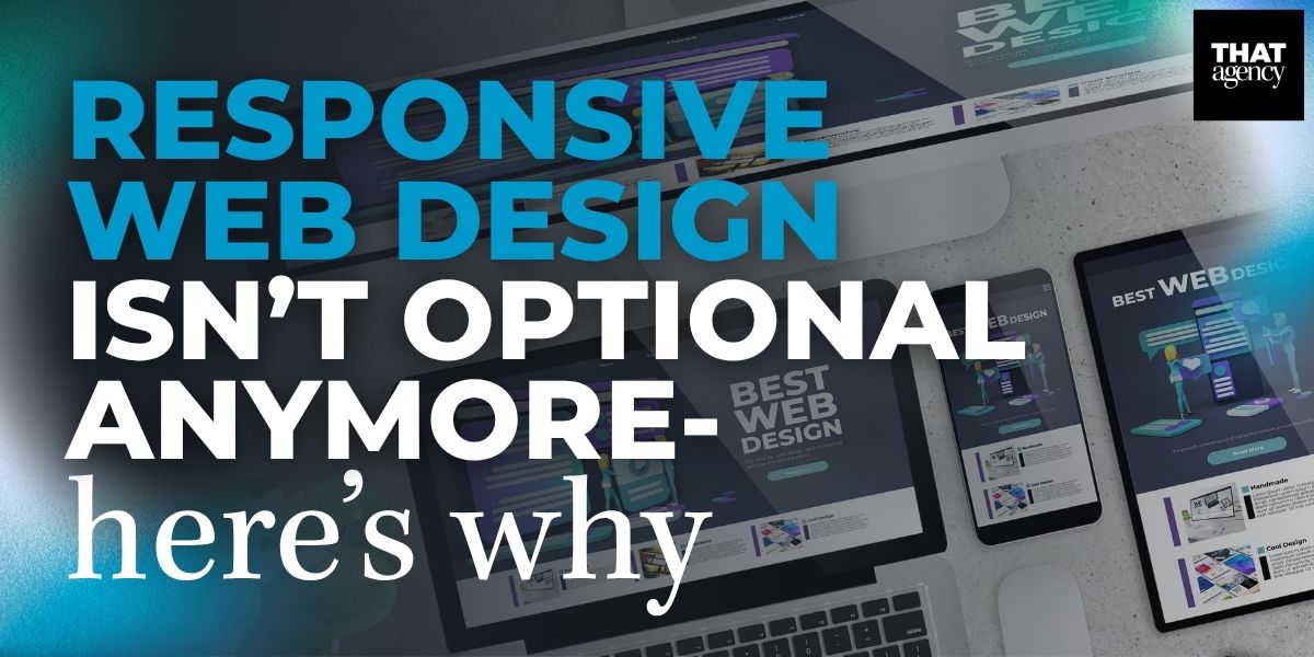
For businesses trying to grow online, a responsive website is no longer just a nice feature. It’s something your business needs to compete. Platforms like WordPress make it easier than ever to build websites that work on all devices, big or small.
In this post, we’ll explain why responsive web design is so important, how it helps your business, and how WordPress web design plays a key role in making your website mobile-friendly.
Why Responsive Web Design Is So Important
If your website doesn’t work well on all devices, like phones, tablets, and computers, you could be losing visitors and customers. That’s why responsive web design is so important. A responsive website automatically changes its layout and design to fit whatever screen someone is using. This improves how people experience your site and helps your business in big ways.
Let’s break down the top reasons why responsive web design matters, and what it means for your business.
Your website visitors are not just sitting at a desk using a computer. They could be checking your site while:
That means your website needs to work well on all screen sizes, from tiny smartphone screens to big desktop monitors.
Any of these problems can make users frustrated. Most won’t stick around, they’ll leave and go to a competitor’s site instead.
A responsive site gives people a smooth experience no matter how they visit, helping them stay longer and engage more with your business.
In 2020, Google made a big change: it started using mobile-first indexing. This means that Google looks at the mobile version of your website first to decide how to rank it in search results.
Pro Tip: Use Google’s Mobile-Friendly Test to check if your site is responsive.
If your website isn’t responsive, Google may not show it to users, no matter how good your business is.
A website should help your business grow. But if it’s hard to use on mobile, it may be doing the opposite.
More than ever, customers are making decisions on their phones, whether it’s booking a service, placing an order, or calling your office.
Did You Know? According to Statista, over 70% of online shopping is now done on mobile devices. Even B2B buyers often do research and compare services on their phones before making decisions.
Benefits of Responsive Design for Conversions:
A responsive site supports your customers’ journey from start to finish, and helps your business make more sales and build stronger relationships.
Can I just build a separate mobile site instead? You can, but it’s not recommended. Having two versions of your site makes updates harder, confuses search engines, and creates more room for error. A responsive site does all the work with just one version.
Does responsive design cost more? While there may be an upfront investment to redesign your site, it often saves money long-term. You don’t have to build and manage multiple versions, and you get better results from search engines and users.
How do I know if my website is responsive? Try viewing it on different devices, or use a free tool like Google’s Mobile-Friendly Test. You can also ask a web design expert, like THAT Agency, for a full review.
Search Engine Optimization (SEO) is what helps your website show up when people search for things on Google. Many people think SEO is only about using the right keywords. While keywords are important, they’re only part of the picture. Google also looks at how well your website performs and how easy it is to use, especially on mobile devices.
Responsive web design plays a big role in how search engines view your site. If your website adjusts properly to different screen sizes, loads quickly, and keeps people on the page, your chances of ranking higher in search results improve.
Here’s a breakdown of how responsive design supports SEO and helps your business get found online.

Why it matters: A slow website frustrates users. They’re more likely to leave and go to a competitor’s site. Google sees this behavior as a sign that your site isn’t helpful or user-friendly.
Why it matters: The longer people stay on your website, the more likely they are to explore your products or services, and the more likely search engines are to see your site as valuable.
Why it matters: If users struggle to read your content or find what they’re looking for, they’ll leave quickly. A clean, readable layout helps users find answers fast, and encourages them to take action.
Why it matters: When Google can crawl and index your site more easily, your content has a better chance of showing up in search results. It also avoids problems like duplicate content or conflicting versions of the same page.
Why it matters:
Is responsive design really that important for SEO? Yes. Google has said that mobile-friendliness is a ranking factor. A responsive site directly improves user experience and performance, two things Google cares about.
What’s the difference between a responsive site and a mobile site? A responsive site automatically adjusts to any screen size using the same content and URL. A mobile site is a separate version made just for smartphones, often using a different URL (like m.website.com). Responsive design is more modern, efficient, and better for SEO.
Can I improve my SEO without making my site responsive? Not really. Even if your keywords are strong, a non-responsive site may still rank lower because of poor user experience and technical issues on mobile.
Does Google rank responsive websites higher? Yes. Google gives preference to mobile-friendly websites. A responsive design helps meet Google’s mobile usability standards, which can boost your rankings.
WordPress Web Design Makes It Easy
WordPress web design is one of the easiest ways to create a responsive website. That’s because WordPress has lots of themes and tools that are already built to work on all screen sizes.
Here’s what makes WordPress a smart choice:
Working with a digital agency like THAT Agency means you’ll get a website that looks great, works fast, and supports your business goals, whether someone visits on a phone, tablet, or computer.
What Happens If You Ignore Responsive Web Design?
If your site doesn’t work well on mobile, it could hurt your business in several ways:
These problems are especially serious if you’re a business owner trying to grow online or stand out in a competitive market.
Not sure if your site is responsive? Here are a few ways to test it:
You can also ask THAT Agency to perform a full audit and let you know what needs to be fixed.
You may need to update or redesign your site if:
A modern, responsive site isn’t just nice to have, it’s necessary to compete online.
Technology is always changing. New devices, screen sizes, and user habits come out every year. Responsive web design helps you stay ready for whatever comes next. It’s a smart investment that keeps your site working for everyone, everywhere.
By making your website responsive, you’ll offer a better experience for your users, and get better results for your business.
Responsive web design is no longer optional, it’s expected. If you want your business to grow, improve your SEO, and provide a smooth customer experience, now is the time to act.
At THAT Agency, we build custom WordPress web design solutions that are responsive, fast, and designed to help you reach your business goals. Explore our Web Design Services or contact us today to get started.

What Is Organic Traffic? (Complete Beginner Guide)
What Is Conversion Rate Optimization? (CRO Basics Explained)
What Is Engagement Rate? (Marketing Metric Explained)

How to Appear in ChatGPT Answers: Understanding AI Citation Signals
AI-Generated SEO Content at Scale: Why Output Without Strategy Damages Authority

700 S. Rosemary Ave.
Suite 204-707
West Palm Beach, FL 33401
P: 561.832.6262
F: 561.832.7707


