
Mobile first design is a must. Google's move to mobile first indexing made it clear that making sure that your website has the best possible experience for users is more important than ever. In addition to Google placing more importance on your website's mobile performance, your users are more likely to be looking at your site on a mobile device than ever before. So, what does this mean for you if you are thinking of redesigning your website? It means thinking mobile first. Here are three tips to consider when redesigning your website from a mobile first perspective.

We all want our website to provide a good user experience, but what does this mean, and how do you make it happen? A good place to start is to take a hard look at your current website and your analytics.
It's easy to get caught up in the aesthetics of your website, in what you think looks good, but your analytics will tell you the real story about how your users are interacting with your website.
Dig into your website analytics. What pages are your users spending the most time on? What pages are they visiting and then leaving quickly? What pages are driving the most conversions? Use these findings to help guide you in redesigning your website.
Are there things you can do to improve the pages that aren't holding people's attention or converting? Can you make the pages that are performing well even better, or even easier to find? Think about the actions that you want your users to take on the site and make sure that you are giving them a clear and easy path to take those actions.
Your shiny new website redesign can be as easy as pie to use and navigate, but it won't matter at all if your users leave before they even see it.
Data from Google shows that 53% of website visits are abandoned on a mobile device if it takes more than three seconds to load. So, if your site takes too long to load, your users might just be moving on to a competitor's site before even giving yours a chance. This means that, when redesigning your website, you should always keep speed at the top of your mind.
One way to do this is to make sure that your images are optimized properly. The new Squoosh App from Google is a great tool to easily compress images right in your browser.
There are also a number of tools available to help you test and optimize the speed of your website. Google's test my site tool is a great one. It will test the speed of your site over a standard 3G connection and show you where you compare on loading times within your industry. In addition, it will give you an overview of things that you can do to improve the speed of your site and even send you a detailed report.
When thinking about redesigning your website from a mobile first design perspective, there are some little things that can make a big difference.
Are you looking at redesigning your website using mobile first design practices? The web design team at THAT Agency can help. Contact us today to find out how!

Tags: Web Design

What Is Organic Traffic? (Complete Beginner Guide)
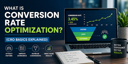
What Is Conversion Rate Optimization? (CRO Basics Explained)
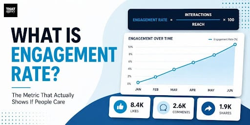
What Is Engagement Rate? (Marketing Metric Explained)

How to Appear in ChatGPT Answers: Understanding AI Citation Signals

AI-Generated SEO Content at Scale: Why Output Without Strategy Damages Authority

700 S. Rosemary Ave.
Suite 204-707
West Palm Beach, FL 33401
P: 561.832.6262
F: 561.832.7707


