Modern websites need to use modern website design. It's easy for your site to get lost in the thousands of other sites that may look just like it. This means being selective, though. Choosing every new trend would make things look like a mess. Each design feature has its own strengths and makes a visitor or user look at your site in a new and different way.
Top 10 Web Design Trends for 2021 and Beyond
.jpg?width=1200&name=top-web-design-trends-for-2020-and-2021-modern-website-features%20(4).jpg)
Over the last several years, the design industry has changed as new trends have come to fruition and become more mainstream. Today, most designs lean towards minimalism, bold colors, and futuristic compositions, and those trends are expected to continue throughout 2020, into 2021, and beyond. Designers across the globe are bent on discovering new color, font, and design trends that move towards balanced and harmonious patterns. While some design trends take time to reveal themselves, the following should be considered right away to help future-proof your website design.
1. Minimalism
.jpg?width=730&name=website-designers-minimalism%20(1).jpg)
The eight-second rule of user experience (UX) gives designers eight seconds to win the attention of users, and the concept of minimalism addresses this notion. Minimalism allows graphic designers to catch users' attentions by including only limited and essential elements. However, until a few years ago, minimalism was synonymous with two colors: white and black – however, this trend has evolved as designers are including more variety in their color palettes and implementing them into their minimalistic designs.
|
“Pictures, abstract symbols, materials, and colors are among the ingredients with which a designer or engineer works. To design is to discover relationships and to make arrangements and rearrangements among these ingredients.”
– Paul Rand
|
2. Scrolling Techniques
You scroll up, you scroll down. Since the dawn of the internet, this has been the tried and true rule. With more devices than ever featuring touch elements, it makes sense for scrolling to catch up. Sites can easily communicate different scrolling features, such as scrolling sideways. This immediately marks your site as different and takes better advantage of how people use their devices.
3. Micro Animations
Micro animation example courtesy of The Digital
New scrolling techniques are paired well with organic micro animations. In other words, you're not scrolling to a new static page, but rather into an animation. This can help guide the eye toward important information contained within quality visuals. It's unpredictable, which keeps a visitor's attention engaged.
>> Concerned about your website's user experience? Request a FREE SEO site audit now.
4. Interactive Designs and features
The trend of animation in the design industry has existed for a long time. It has, over the years, also seen developments that have taken the industry by storm. Interactive designs were among the more popular trends of 2019, and that trend is continuing in 2020 - and it's expected to continue moving forward into 2021 and beyond.
Interactive designs, which aren’t just limited to graphic design (web designs can be interactive too!) are widely popular among audiences and do an excellent job of catching and holding their attentions – show your viewers one interactive element and they will stay on your site looking for more. Graphic designers will take advantage of this tendency and continue coming up with more interactive designs.
Interactive features of high quality are designed to impress. They're often presented in the form of graphs or maps, and they convey information that's either useful or interesting to a customer. They pair especially well with content creation. Perhaps an interactive feature is used to illustrate the rich history of a particular industry or how a certain technology or product has spread around the world over time. These features are deeply engaging and contain the type of information that helps a customer trust the knowledge a brand communicates.
It's too easy for websites to come across as boring and uneventful these days. Modern websites need to take advantage of modern abilities. When you rotate certain elements - such as animations or intro screens - it means that someone sees your business introduced in different ways every time they visit. There needs to be consistent elements so that they know they're in the right place, but incorporating certain elements that will be different with every visit helps keep those visits fresh.
5. Futuristic Images and Patterns
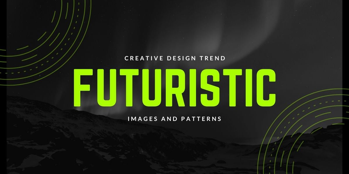
The use of futuristic images and patterns in design will be big this year, primarily owing to the availability of sophisticated tools that allows designers to create anything their mind can conceive. More and more companies are changing their branding strategies to include these futuristic patterns and images to garner audiences’ attentions. In 2020 and 2021, continue to look for designers to go all out and produce designs that hit the eye immediately.
One way to do this is by using three-dimensional elements. You don't have to go full VR to give your website a sense of depth and scale. Simple effects can lend two-dimensional objects the impression of having depth. Creating visual layers, as if certain objects are in the foreground and others are in the background, also provides depth. These effects are employ simple design touches that make users feel more comfortable.
>> Find out how future-proof your website is with a FREE SEO site audit.
6. Abstract and Asymmetric visuals
.jpg?width=1200&name=top-web-design-trends-for-2020-and-2021-modern-website-features%20(1).jpg)
Abstract and asymmetric design example courtesy of Tej Chauhan
Another more experimental and difficult way to achieve futurism is through abstraction. Abstract designs should be rooted in a core visual element. Abstract shapes can employ gradients to set them apart, or they should foreground large text so that the leading messages you want to communicate don't get lost.
Abstract menu design can feature a different menu option at every corner of the screen, but they have to be obvious – even on phone screens. If you employ this, you can have the next page scroll in from that particular corner, complete with animations.
Futuristic can also be asymmetrical. Asymmetric visuals take advantage of negative space on the screen. By incorporating negative space in a certain area, you can highlight important information in a concise and visually appealing way. Doing so symmetrically risks a page appearing boring, predictable, or like an advertisement. Doing so asymmetrically (within reason) encourages someone's attention. Combining features like negative space, gradients, asymmetry, and slightly diagonal presentation makes information feel urgent.
7. gradients
.jpg?width=1200&name=top-web-design-trends-for-2020-and-2021-modern-website-features%20(3).jpg)
Speaking of gradients, one of the older rules of photography and graphic design is eye line. Images that feature people or characters should often incorporate eyes looking and hands gesturing to the next element of the page you want a visitor to read. This creates a natural flow between image and text, but sometimes it's obvious and it shouldn't be overused. Gradients work much the same way. By featuring gradient color-shifts across a page, you can guide the eye so that reading information and being guided through text feels more natural and comfortable.
8. bottom-up or thumb-driven navigation
.jpg?width=1200&name=top-web-design-trends-for-2020-and-2021-modern-website-features%20(2).jpg)
Thumb-zone map example courtesy of Smashing Magazine
Most menus are located at the top of the page. Some businesses are savvy enough to incorporate menus located at the side, or that pop-in when mousing over to the side. These are especially useful with widescreen monitors and mobile devices in landscape mode. However, one modern website design element that can add to the user-friendliness of your website is locating the menu at the bottom. This prioritizes the visuals and information higher up while providing an extra level of comfort for mobile device users.
9. Artistic and large Typography
Artistic typography is more popular than ever. Designers are looking for innovations in typography to gather attention. Maxi typography, which is a typography concept dealing with heavy, thick, bold and attention-seeking fonts, became prevalent in 2019 and did well. Moreover, it’s safe to assume that 2020 will be the year of thicker fonts and large-size lettering.
This is especially important as mobile devices are out-pacing the use of computers. Larger text is easier on the eyes. It also forces you to simplify certain messages. This captures attention. Larger text also allows the visuals behind them to be more complex: including video and animations. This may be modern trend online, but if you think about how TV commercials have employed large text and simplified messages, it's actually a proven strategy that's only now becoming more useful online.
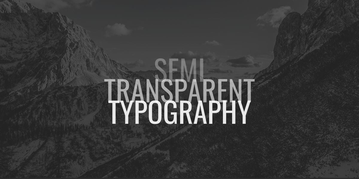
Similarly, 2019 saw designers using two-dimensional and three-dimensional shapes along with typography to catch users’ attention. This trend is also likely to grow in 2020, along with higher demand for semi-transparent typography trends. Semi-transparency deals with the concept of overlapping word sections over one another, with the second copy being semi-transparent over images, media, and other elements of the design. I believe it will be a focal point of many design concepts in 2020 and beyond.
>> User experience involves more than design. Request a FREE SEO site audit today.
10. color schemes
Perhaps there's a product that some customers are big fans of. It's associated with a certain color scheme. You can create a color scheme built toward celebrating their enjoyment of this product. Other customers might get a color scheme that's different based on what they've purchased or visited before. Enabling customers to change color schemes can help them customize the site's presentation the way they like it. You'll want to limit the color schemes to pages that you've tested in each scheme for presentation and readability.
One very popular (and very underused) feature is using a dark mode for customers who may be browsing just before bedtime. Rather than dark text on a bright background, this can switch to brighter text on a darker background, helping save eye strain and making your site more comfortable to browse at night. Being able to customize your website even in small ways like this makes a visitor feel invested in it and more likely to return.
In Conclusion
2020 and 2021 are, or will be, all about innovative typography, futuristic designs, minimalism, and unique elements coming together: the real and artificial, the intangible and tangible, the past and the future. Moreover, you can expect to see designers aiming for simplicity in design, with various types of abstract elements implemented.
You can see how different elements here can be combined and blended together to create memorable website user experiences. When combining elements, always have a list that prioritizes each from most to least important. This sustains a core visual design across the entire website - and if things ever get too busy, you know which element should be cut first. Remember, the key is to convert searches into clicks - and exploration into purchases. Be disciplined with how you employ these modern website design features and you'll get there quickly.
And remember - these design principles in collaboration can be used to create hand-crafted pieces of art that are used to deliver powerful messages. How you use the ingredients is completely up to you.
To set some creative trends of your own in 2020 and 2021, contact THAT Agency and put our talented graphic and website designers to work for you!

