
If you'd like to see part one of the series you can go here: CSS Absolute Positioning.
In part 2, I'd like to go over CSS rounded corners. For ages I've spent time poring over websites trying to figure out what method would work best for getting me those coveted round corners in my site. The method we will be discussing today provides you with a box that is not only stretchable horizontally, but vertically as well, thus making this solution totally dynamic.
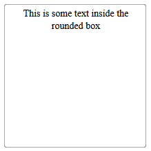
This method makes use of absolute positioning to create our edges and corners. There are quite a few variations based on what you're trying to do with your rounded corners, but we'll just be covering a simple box with a 1px rounded border like so:
The first thing you're going to need are the images for each of the corners, and a one pixel image that is the same color. You can do this manually, or you can use a site like http://www.generateit.net/rounded-corner/ to generate your corners for you. I generally do the latter since everything is pre-cut and ready to go.
After you have the images, the HTML to create the box is pretty straightforward:
<div class="roundBox">
          <span class="top"> </span>

		 <span class="left">   </span>
		 <span class="right">   </span>
		 <span class="top-left">   </span>
		 <span class="top-right">   </span>
		 <span class="bottom-right">   </span>
		 <span class="bottom-left">   </span>
<div class="roundBoxText">
        This is some text inside the rounded box</div>

<!-- End Round Box Text --></div>

<!-- End Round Box -->
To explain the above code, we are basically creating a container "roundBox" to house the borders, and then creating the 's for each corner and edge of the box. This can be used as the basic html for a wide variety of rounded corner boxes.
Next, the css gets a little more inolved:
On to the css:
.roundBox {
position: relative;
padding: 4px 0px 4px 6px;
font-size: 14px;
height: 200px;
width: 200px;
text-align: center;
}
.roundBox .roundBoxText {
position: relative;
z-index: 2;
}
.roundBox .top-left, .roundBox .top-right, .roundBox .bottom-right, .roundBox .bottom-left, .roundBox .top, .roundBox .bottom, .roundBox .left, .roundBox .right {
position: absolute;
z-index: 1;
font-size: 0;
line-height: 0;
}
.roundBox .top, .roundBox .bottom {left: 3px;right: 3px; height: 3px;  }
.roundBox .left, .roundBox .right { top: 3px;bottom: 3px;width: 3px;}
.roundBox .top { top: 0; background: url(img/border.jpg) left top repeat-x;}
.roundBox .bottom {bottom: 0; background: url(img/border.jpg) left bottom repeat-x;}
.roundBox .left {left: 0; background: url(img/border.jpg) left top repeat-y;}
.roundBox .right { right: 0; background: url(img/border.jpg) right top repeat-y;}
.roundBox .top-left, .roundBox .top-right, .roundBox .bottom-right, .roundBox .bottom-left { height: 3px; width: 3px;}
.roundBox .top-left {top: 0; left: 0; background: url(img/tpl.png) left top no-repeat;}
.roundBox .top-right {top: 0;right: 0;background: url(img/tpr.png) right top no-repeat;}
.roundBox .bottom-right {bottom: 0; right: 0; background: url(img/btr.png) right bottom no-repeat;}
.roundBox .bottom-left { bottom: 0; left: 0;background: url(img/btl.png) left bottom no-repeat;}
This CSS looks very complicated, but is actually quite simple. In the first part, we are setting the general width and height of the box, and setting a few styling things like font size. The most important part of this is the position: relative. Building upon our previous post where we dealt with absolute positioning, this is necessary in order for the borders to be contained inside the container.
Next we are going to set each of the corners to position: absolute;, and give them a lower z-index than the content div (this isn't necessary for this example, but you may have large borders that go under text in your own work). We then take each corner and edge and set them to their appropriate positions. For example, top-left would end up with top:0 and left:0;. For the edges, you will notice that the positions are not 0. This is done to keep the repeating edges from overlapping the corners.
And there you have it, a box with rounded corners with compatibility for all major browsers. This solution is great because it doesn't require javascript, or any CSS hacks to work. It is just plain HTML and CSS. I do apologize to the HTML purists out there who don't like the extra markup in their code, but it is my opinion that the tradeoff for universal support is well worth it.
See the live demo below, or download the source files:
Demo
Source Code
Tags: Web Development, General

THAT Agency Partners with Spectrum Exteriors for Colorado Hail Recovery

THAT Agency Partners with Tech Service Today to Boost IT Digital Presence

Email Marketing Tips: 7 Unique Strategies Backed by Research

SEO for Dentists: How to Attract More Patients in 2025
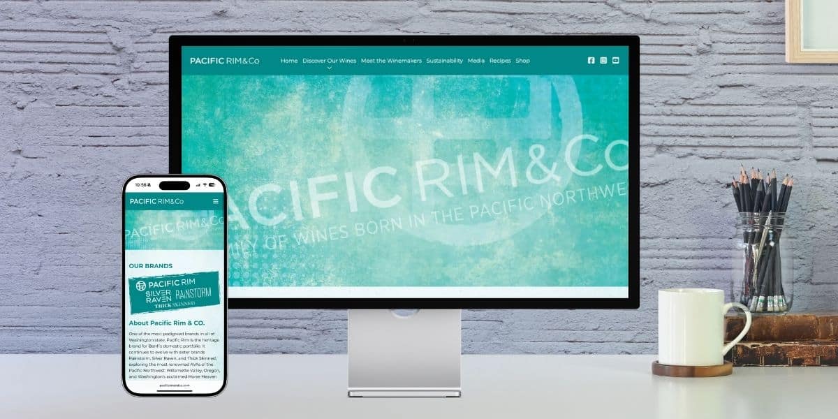
THAT Agency Launches New Website for Pacific Rim & Co.

2000 Palm Beach Lakes Blvd
Suite 601
West Palm Beach, FL 33409
P: 561.832.6262
F: 561.832.7707


