No business likes to admit it, but sometimes your site could be performing much better than it currently is. It’s inevitable. You launch a site, let it do its thing for a few years, and it slowly becomes outdated. While it still might be aesthetically appealing, software updates and changes in user preferences can leave you with a site that brings in less than optimal results. If your digital campaigns have been slipping, here are a few telltale signs you’re overdue for a website redesign.

Mobile Friendliness
If you’re on the go and are hesitant to show someone your site on your smartphone, it’s time to make some changes. Stats show that 2 out of every 3 minutes spent online is spent on mobile devices. The mobile movement is much more than a trend, it’s normal. Not only this, but it’s expected. If your site fails to load quickly, elements are hanging off the page, or if users need to zoom in to digest your content, you’re missing out on valuable opportunity.
When determining search rankings, Google factors in your mobile friendliness. If you’re not optimized for mobile, not only does it provide a negative user experience, but your organic traffic might be slipping as well. It’s 2017, look around. Everyone has a smartphone. It’s time to give them what they’re looking for, regardless of where they are.
Site Speed
Most users will leave a page if it takes longer than 3 seconds to load, and it’s even shorter on mobile devices. To add on to this, 41% of people won’t come back if a site failed to load on the first try. It’s increasingly important nowadays that you not only be there for your audience on every device, but also be there when they are.
Your website is your biggest digital marketing asset. Users will associate the experience they have on your site with the experience they’ll have if they end up converting. In order to give them what they want, you need to give it to them quickly.
On mobile, analyze your critical rendering path (CRP). Having a mobile website means you need to understand the mobile web experience. Take out any unnecessary elements from the page to create as little friction for the mobile journey to conversion. This will speed up both your site, and the user conversion path.
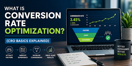
Decreases in Conversion Rate
If your site used to bring the results your business depended on and have suddenly or slowly dropped off, you might need a redesign. Regardless of the underlying problem, people don’t see the value of converting on your website. Something about it makes them go back, close out, or go to your competitor. A thorough redesign will identify the holes in the conversion process and patch them up with a data-driven solution.
Analytics Slump
Never underestimate the power behind numbers. Taking a look at your site analytics can identify a host of opportunities for improvement. If you have little to no organic traffic, then you might need a redesign centered around a solid seo strategy. If you have a ton of direct traffic that has a low conversion rate, it shows you have a well-established brand but you might need to focus on balancing functionality with user experience.
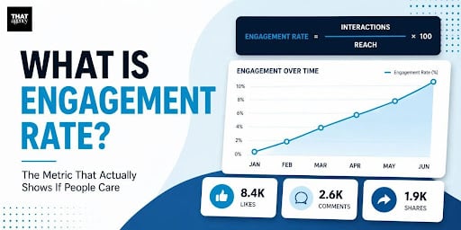
Your analytics explain where your users are coming from and how they’re interacting on your website. Looking into numbers like bounce rate, conversion rate, device type, and referral source can reveal trends in behavior and turn those into impactful changes for your site.
Making Changes is Inefficient
Let’s talk about you for a second. If you resent making changes to your site because you have to find and edit snippets of code each time, it’s time for a redesign. Unless you’re making big changes to your site, you shouldn’t have to allocate a huge portion of time towards it. It should be easy for anyone on your marketing and design team to go in and make necessary edits.
This is often a sign your website looks and feels outdated. Software such as HubSpot allows you to easily build, manage, and maintain your site in a central location. If you’re looking for a more manageable website, then a centralized “operating center” should be the focus of your redesign. This is the first step to building an agile site.
Losing your Competitive Edge
Do you ever think, “I wish my site looked as great as [insert competitor]”? Or what if you get a decent amount prospective customers, but lose the contract to your competitor? If either of these situations resonates with you it’s time to make a change. The overall design, layout, and feel of your site is often your brand’s first impression.
If this first impression isn’t on target, you’re already helping your competition. The last thing you want to do is copy your competitors, but analyzing your strengths and weakness against theirs will allow you to properly convey your unique value proposition (UVP). Your UVP is whatever you can offer users that your competition can’t. It’s your secret sauce.
Make sure your UVP passes a 5 second test. The 5 second test is when you show someone a page for 5 seconds and see if they can identify its purpose. If not, you might need to focus on simplicity and demonstrating clear value to your users.
If you identify with any of these, you might be considering a website redesign. Understand that before you undergo any drastic change, you need to plan and strategize. If you’re unsure of where to begin, talk to a web design agency. They’ll be able to evaluate your site and identify opportunities for growth. Focusing on the opportunities instead of weaknesses allows you to set a goal for your business and build a strategy towards achievement.


