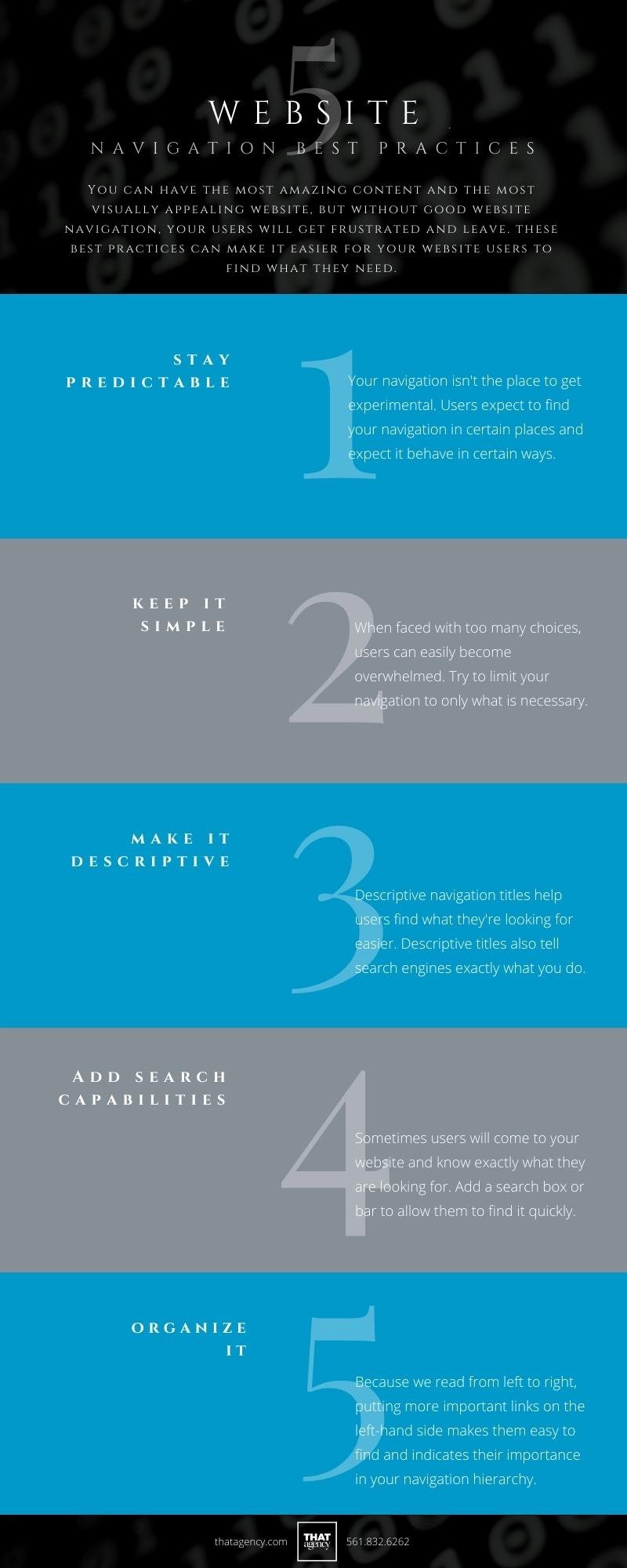
No matter what type of business you have, users are coming to your website to DO something, whether it is buying widgets, reading a blog, or finding more information about your company and products. Navigation is what helps them find their way and find what they are looking for. You can have the most amazing content and the most visually appealing website, but without good website navigation, your users will get frustrated and leave. Navigation is crucial to the success of your website. Here are five website navigation best practices to help make it easy for your users to find what they are looking for.

5 Website Navigation Best Practices
1. Stay Predictable to stay user friendly
While it's fun to mix up your website design and try for that new cutting-edge look, your navigation isn't the place to get experimental. Users expect to find your website navigation in certain places and expect it to behave in certain ways. Stick with these conventions to make things easy and predictable for your users. Some examples of these conventions are situating the main menu horizontally near the top of the page, having the company logo in the same place on every page link to the home page so users can easily find their way back, using a hamburger menu on mobile.
2. Keep it Simple
When designing your navigation, it's easy to fall into the trap of trying to fit everything into it under the mistaken impression that if you give your users ALL the choices, they will be able to find their way. In reality, it's best to try to keep your navigation as simple as possible. When faced with too many choices, users can easily become overwhelmed. Try to limit your navigation to only what is necessary and what will help users find what they need easily, and thus convert on your website.
3. Make it Descriptive
It's easy to fall into the trap of using generic titles in your navigation. So many other websites use titles like About Us, Products, Services, maybe you should too right? In this case following the crowd is not always best. When you use more descriptive navigation titles, it helps users find what they are looking for more easily. Using descriptive titles also tells Google and other search engines more specifically what you do. Also try to avoid format based titles, users don't care as much about the format of the content as they do about what's in it. For example instead of using whitepapers try a more descriptive terms that gets at the heart of what your users will find in those whitepapers.
4. Add Search capabilities
Sometimes users will come to your site and know exactly what they are looking for. Add a search box to allow them to find it quickly. This is especially pertinent for eCommerce sites, think about how you use Amazon do you generally go through and navigate your way via the menu drilling down from department to product? No, you probably just go straight to the search bar and type in what you are looking for, allow your users this same convenience.
5. Organize It
Once you have your website navigation titles settled on, it's time to think about what goes where. Think about what the most important pages/categories are and locate these to the left (if you are using a traditional horizontal navigation layout) Because we read from left to right, putting more important links on the left-hand side makes it easy to find them first and indicates their importance in your navigation hierarchy.
5 Website Navigation Best Practices: An INfographic

Share this Infographic On Your Site
Put These Website Navigation Best Practices to Work
Now that you know five best practices for website navigation, it’s time to put these tactics to work. Contact the award-winning website design and development team at THAT Agency today at 561.832.6262 for assistance in implementing good website navigation for a better user experience.

___
Editor's Note: This post was originally published in April 2019 and has been updated for freshness, accuracy, and comprehensiveness.