
Tags: Web Design
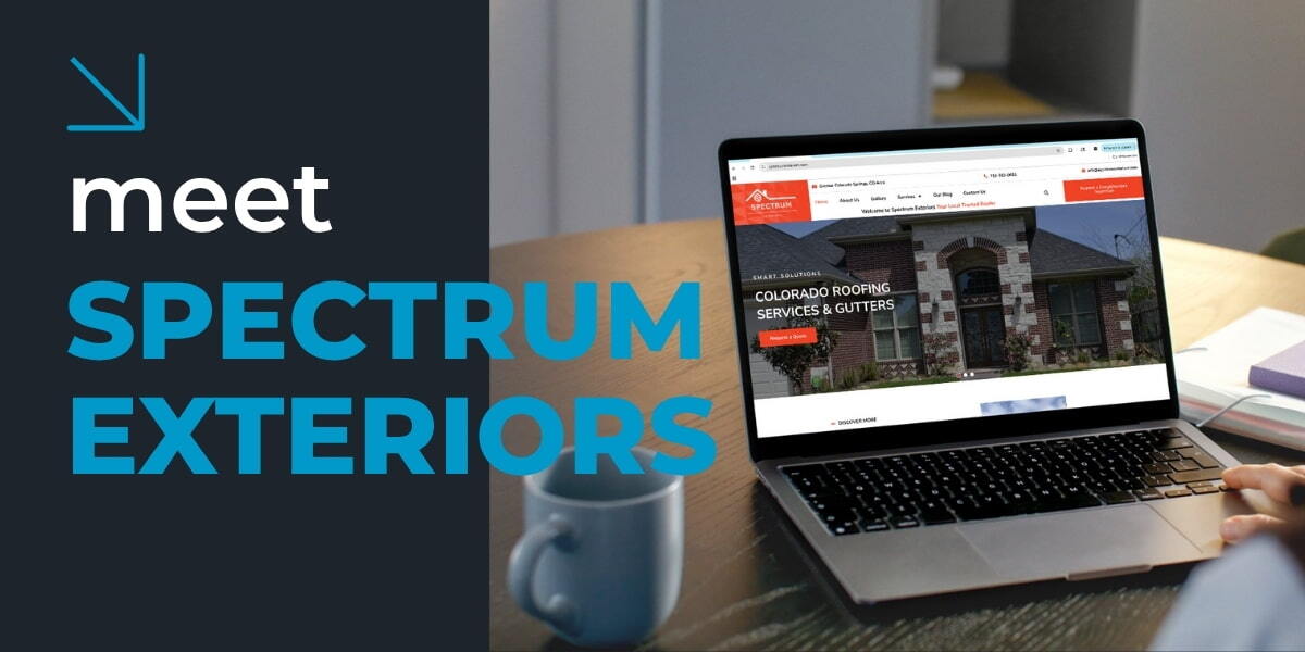
THAT Agency Partners with Spectrum Exteriors for Colorado Hail Recovery

Google Ads for Car Dealerships: Boost Test Drives with These Proven Campaigns

SEO for Electricians: How to Get Found by High-Paying Clients
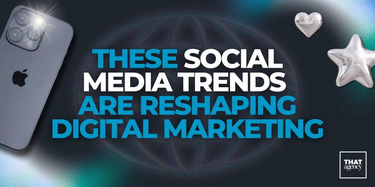
These Social Media Trends Are Reshaping Digital Marketing

What Most Brands Get Wrong About Marketing Funnel Stages
700 S. Rosemary Ave.
Suite 204-707
West Palm Beach, FL 33401
P: 561.832.6262
F: 561.832.7707


