
Sometimes the best way to understand what to do in web design is to first know what not to do. We have compiled a list of things you can be sure will anger your visitors. And remember, angry visitors have the potential to become detractors, and you want promoters!
Not much need for explanation here. Pop-ups are just annoying; especially the ones that are impossible to close. Some claim that pop-ups are still an effective way of advertising, but we have trouble understanding this considering most web browsers now come with pop-up blockers already enabled. The only sort of pop-ups you should have on your site are CTA's or chatbots.
We have seen this over and over again. Most website visitors are not patient. If your page takes too long to load they will move on! It’s much better to have a page that is simpler but loads quickly than one that is crowded and takes forever. A page should load in under 4 seconds. Check your site speed! We use PageSpeed Insights.
Such a high percentage of searches occur on mobile now, that if your site isn't optimized for both, then it's going to be hard to navigate, and your site visitors are going to get frustrated. They'll accidentally click things they didn't mean to, they'll have to pinch and zoom all over the place, and then they'll leave.
Don’t make contacting you harder than it has to be. Nothing is more frustrating than trying to get in touch with a company that has hidden its contact information.
Make sure getting around on your site is easy. It should be as easy to go to the next page as it to go back to the first.
Try to use headings and sub-headings to separate content. These will make information easier to read and will make it simple to find what you want.
Make sure your text is readable. This means dark text on a light background. Just keep it simple. It will make it look much more professional.
Update your site often. If you don’t, then people will think you're out of touch, and they'll want to work with someone who looks like they're on top of their game.

If at all possible, don’t make registration required to see aspects of your site. Of course, you want to collect contact info for people who are interested in what you have to offer, but you can find a better way of doing that. People are way more likely to give you their info once you have built up enough value in their eyes.
Tags: Web Design

Metrics that Matter: How to Measure Content Marketing Strategies

From Visibility to Loyalty: Content Marketing's Role in Brand Equity

Storytelling Strategies: How Content Marketing Shapes Brand Perception
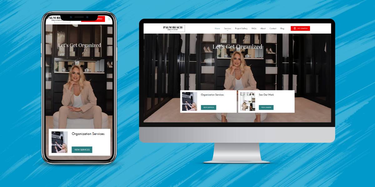
Agency Launches Innovative Partnership With Palm Beach Organized

Content Marketing for Dummies: Tips, Solutions, and Considerations

2000 Palm Beach Lakes Blvd
Suite 601
West Palm Beach, FL 33409
P: 561.832.6262
F: 561.832.7707


